Summary for the Blog
- What is Data Interpretation? It’s the process of giving meaning to collected data, drawing conclusions, and making informed decisions. It’s crucial for transforming complex information into actionable insights and identifying trends.
- Types of Data Interpretation: There are three main types: Quantitative (analyzing numbers), Qualitative (analyzing non-numerical information like text), and Mixed Methods (combining both).
- Process of Interpretation: The process involves six steps: establishing a baseline, collecting data, preparing data, interpreting, visualizing, and reflecting on the findings.
- Limitations and Distinction from Data Analysis: Data interpretation has limitations like data quality issues, cognitive biases, and subjectivity. It differs from data analysis in that analysis uncovers patterns, while interpretation focuses on making sense of those patterns and drawing conclusions.
What is Data Interpretation?
Data interpretation is the process of examining collected information and turning it into something meaningful. It goes beyond just looking at numbers, it helps you identify trends, patterns, and key insights that explain what the data is really saying. This often involves using statistical or mathematical methods, creating visuals like charts and graphs to simplify complex details, and putting the information into context so it’s easier to understand. The ultimate goal of data interpretation is to transform raw data into clear, actionable recommendations that guide smarter decisions.
Note: Before interpreting data, you must check this guide on how to track data and what data tracking is.
What are the Types of Data Interpretation?
There are three types of data interpretation, including:

1. Quantitative Data Interpretation
Quantitative data interpretation involves analyzing numbers to make sense of them. This type of data is typically used to measure and evaluate specific metrics, like sales performance, customer satisfaction scores, or employee productivity levels. It’s all about turning raw numbers into valuable insights.
2. Qualitative Data Interpretation
Qualitative data interpretation focuses on analyzing non-numerical information like text, images, or audio. It’s commonly used to explore customer opinions and attitudes, helping you uncover deeper insights and spot patterns or trends that might not be immediately obvious from numbers alone.
3. Mixed Methods Data Interpretation
Mixed methods data interpretation blends both quantitative and qualitative data to offer a more well-rounded understanding of a topic.
This approach is especially helpful when dealing with data that includes numbers and non-numerical insights, like customer feedback, allowing for a fuller picture of the situation.
Also Read: Marketing Mix Modeling for Strategic Success
View All Your Marketing and Website Data - Instantly
Connect Instagram, Mailchimp, Google Analytics & more
Pre-built dashboards, no setup needed
Save hours on reporting every week
What is the Process of Interpreting Data?
Now that you know the types of data interpretation, it’s time to learn how to interpret data, from the beginning to the end.
There are six key steps in data interpretation, including baseline establishment, data collection, data preparation, interpretation, visualization, and reflection. Let’s learn about them in detail:
1. Baseline Establishment
Just like in a competitive analysis, the first thing you need to do when interpreting data is establish a clear starting point. This means setting specific objectives and mapping out both your short-term and long-term goals that could be influenced by what you find in the data.
For instance, if you’re an investor, you might focus on setting targets related to the return on investment (ROI) for the companies you’re assessing. Don’t forget, at this stage, it’s equally crucial to decide which kind of data you’ll be diving into for analysis and interpretation.
2. Data Collection
Once you have established your baseline, it’s time to collect data. A good way to start is by visualizing it—maybe through a bar chart, graph, or pie chart.
The goal here is to ensure you’re analyzing the data clearly and without any bias. At this point, think back to how you conducted your research.
Here are a couple of key questions to ask yourself:
- Did anything change or go wrong during the data collection process?
- Do you have any notes or observations saved from that time?
- Once you’ve gathered all your data and answered these questions, you’re ready to move on to the next step.
Also Read: What is Data Blending?
3. Data Preparation
After gathering your data, the next step is getting it ready for analysis. This often means cleaning it up by correcting any errors, filling in missing values, or removing outliers. You might also need to reformat the data to make it easier and more effective to analyze.
4. Interpretation
This step is crucial in the data interpretation process—it’s where you actually analyze the data you’ve gathered. This is also where you’ll decide whether to take a qualitative or quantitative approach.
If you choose qualitative analysis, you’ll be looking at the data from a more subjective angle. When using AI-driven tools for this, you’ll need to “code” the data extensively to capture personal sentiments that can’t be easily represented by numbers.
On the other hand, quantitative analysis involves a more objective, numbers-based approach. You’ll work with raw numerical data, calculating things like mean, standard deviation, and ratios. From there, you can use statistical models to dive deeper into behaviors, helping to predict trends and outcomes.
5. Visualization
Once your analysis is finished, it’s time to visualize your data and extract insights from different angles. Many companies today use dashboards for this step, offering quick, real-time insights through algorithms.
However, even without a dashboard, visualizing data is fairly simple. You’ll just need to format your data in a way that makes it easy to present visually.
Some common formats you can use include:
- Bar charts
- Tables
- Scatter plots
- Line graphs
- Pie charts
- Histograms
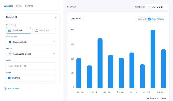
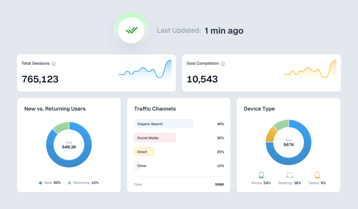
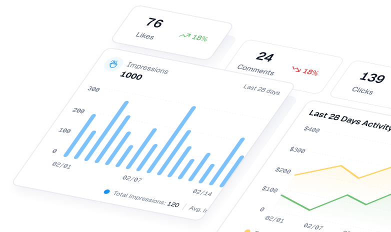
ViewMetrics provides an impressive array of customizable charts and graphs, allowing you to effortlessly create the ideal visual for your data. With its interactive dashboards, you can dive into your data from various perspectives and discover insights you might have otherwise overlooked.
Free performance templates simplify reporting. Start for free today.
6. Reflection
Finally, after you’ve crafted the right visualizations that align with your initial goals, it’s time to take a step back and reflect. While this might feel like a simpler task compared to the earlier stages, it’s actually a critical moment that can shape how effectively you interpret your data.
Use this time to review the entire data analysis process, search for any hidden relationships, and spot outliers or mistakes that might have slipped through during data cleaning. It’s important here to distinguish between correlation and causation, recognize any biases, and catch insights you may have overlooked.
Smarter Decisions with ViewMetrics – Get real-time insights, seamless integrations, and comprehensive reporting—all in one place.
How Can Data Interpretation Be Used in Different Industries?
There are several use cases for data interpretation in different industries and settings, such as marketing, healthcare, financial services, retail, and manufacturing.
Let’s see how data interpretation can be used in these different industries:

- Marketing – Marketers analyze customer behaviors, preferences, and trends through data to develop targeted strategies and campaigns.
- Finance – Financial companies evaluate investment performance through data, helping them make informed decisions on investment strategies.
- Healthcare – Healthcare professionals assess patient histories and test results using data, aiding in accurate diagnoses and treatment plans.
- Manufacturing – Manufacturers use data to monitor machine performance and inventory levels, improving production efficiency and management.
- Retail – Retailers study sales figures and customer habits to optimize merchandising and pricing strategies.
What are the Limitations of Interpreting Data?
There are some limitations to data interpretation, such as:
- The quality of data directly impacts the accuracy of interpretation—poor data leads to flawed conclusions.
- Cognitive biases and preconceptions can influence how data is interpreted, often leading us to see what we want or expect to see.
- Interpretation is subjective—what appears as a clear pattern to one person might seem like random noise to another.
- It can be time-consuming to properly interpret data.
- Communicating results in a way that others understand and agree with can be challenging.
- Specialized skills and knowledge are often required, and professional assistance may be necessary.
- External factors, like confounding variables, can affect the observed patterns and aren’t always accounted for in the data.
- Identifying patterns is inherently difficult because randomness exists in all data sets.
- Using multiple interpretation methods can help reduce bias and improve accuracy.
Data Analysis Vs. Data Interpretation
|
Aspects |
Data Analysis |
Data Interpretation |
|---|---|---|
|
Objective |
The main goal is to process and organize raw data to uncover trends and patterns. |
Use the analyzed data to make sense of it, provide context, and draw conclusions. |
|
Process |
It starts with gathering data, then cleaning it up, transforming it into a usable format, and finally applying analytical methods to draw insights. |
It includes analyzing and interpreting the results to explain key insights and recommend the next steps. |
|
Focus |
It helps answer the ‘what’ and ‘how’ questions surrounding the data. |
It helps answer the ‘why’ and ‘what next’ aspects based on the results. |
|
Nature |
It is more quantitative and technical. |
It is more qualitative and subjective. |
|
Outcome |
Known to produce statistical outputs, structured data, and models. |
Known to provide more conclusions, insights, and recommendations. |
|
Decision-Making |
Provides evidence and data for supporting decisions. |
Influences decision-making by directly informing. |
|
Dependency | It can be done independently, but its effectiveness is restricted without proper interpretation. | Depends on the outcomes of data analysis and can’t happen without it. |
Also Read: What is Digital Analytics and Why Is It Important?
How to Create a Data Interpretation Report with ViewMetrics?
While data interpretation is necessary when analyzing your data and coming to conclusive decisions, it doesn’t need to be time-consuming. Creating manual data interpretation reports requires you to go through the tedious process of logging into multiple marketing tools, copying and pasting the data to a spreadsheet, and then repeating the same process for every client.
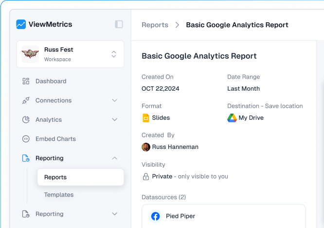
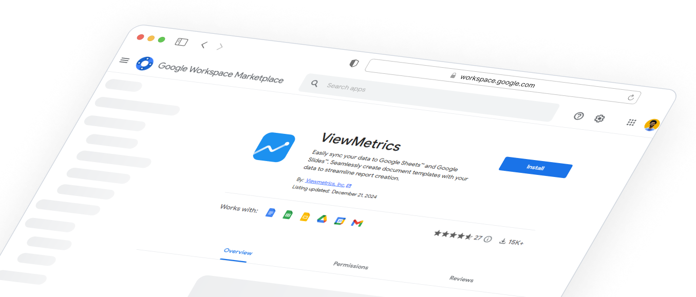
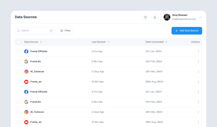
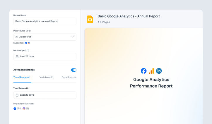
But with ViewMetrics, you can eliminate this old-school way by adopting the right amount of automation! All you have to do is connect all your marketing accounts in our platform, select a report template, and we’ll handle the rest.

